VOX Visualizations and Metrics
datavizandcharts.RmdIntroduction
The VOX Analysis Application and Package provide many distinct data visualizations and measures of variability to assist a user in diagnosing a speaker with autism spectrum disorder.
This article provides descriptions for these various measures, data visualizations, and tables found in the reports. It also provides (as an extra resource) instructions for R users to produce these resources using the `{voxanalysis} package, without needing to access the application.
A user can generate a summary report with these measures, data visualizations, and tables with the instructions found here.
Optional: Use {voxanalysis} Package
Though the VOX Application is the recommended way for most users to generate reports, R users can generate the same statistical measures, data visualizations, and tables found in the report using the voxanalysis package directly. Psychometricians and researchers may find this approach more preferable.
The package’s R functions use the following prefixes:
calc_ functions return a vector or list with the measure(s) of interest
plot_ functions return a data visualization
table_ functions return a data.frame
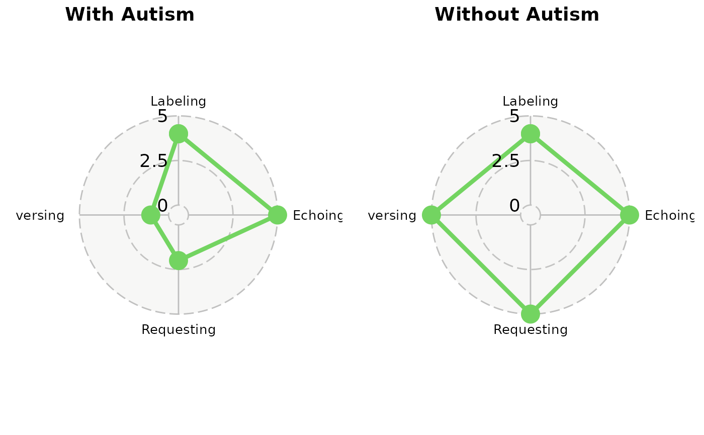
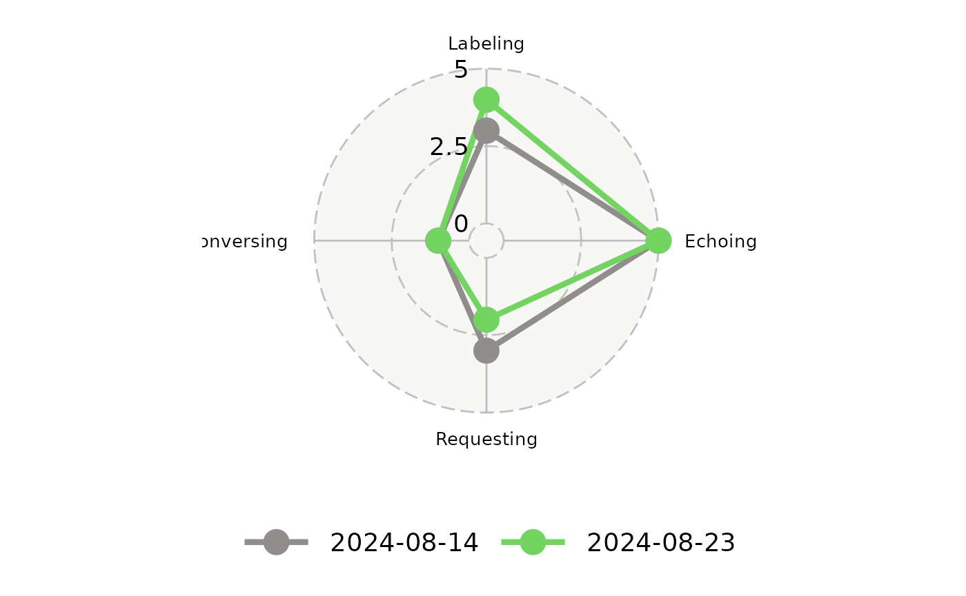
Area Q Plot
The Area Q plot shows a visual representation of the speaker’s verbal repertoire, illustrating the balance (or lack thereof) across the four response types (conversing, labeling, echoing, and requesting).
The two Area Q plots below show two different speakers. The one on the left shows a speaker with a verbal repertoire more typical of a person with autism, because there is an imbalance between the four response types. The labeling and echoing of the speaker with autism is disproportionately strong compared to conversing and requesting. The speaker on the right shows relative balance in all four response types, which is tyipcial of someone without autism.
An R user can generate Area Q Chart using the
plot_area_q function.
The function requires a parameter called
df_summarized_response that follows the Summary
Data data model. An example of this data frame can be seen with
data("df_summarized_response_example").
Note that this function can accept only two distinct
date_of_evalution entry inside
df_summarized_response. The user will need to set the
date_primary parameter in plot_area_q to a
specific date_of_evaluation if there are more than two
unique date_of_evaluation.
See ?plot_area_q and
?df_summarized_response_example for more details.
library(dplyr)
data("df_summarized_response_example")

df_summarized_response <- df_summarized_response_example %>%
  slice_max(order_by = date_of_evaluation, n = 2)

plot_area_q(
  df_summarized_response,
  date_primary = max(df_summarized_response$date_of_evaluation) # use date_primary to determine darker color on plot
  )
Area Q Metrics
The Area Q plot can be supplemented by additional metrics:
- Centroid is the geometric center of all four points drawn by the plot
- Centroidal Distance is the distant of the centroid from the chart’s origin (0, 0)
- Moment of Area Q is the area of the polygon displayed on the chart
The results for these calculations vary based on whether a speaker has autism.
A centroidal distance closer to 0 is typical of person without autism, whereas a centroidal distance further from 0 indicates greater disproportionality their verbal repertoire. If the VOX Analysis contains 12 referents, the maximum centroidal distance possible is 6, which indicates a far higher chance that the speaker has autism.
Moment of Area Q represents the size of the speaker’s language repertoire, as shown on the Area Q plot. A larger number is more typical of a person without autism, while a smaller number is more typical of a speaker with autism.
| Measure | With Autism | Without Autism |
|---|---|---|
| centroid | ( x = 1.33, y = -2.67) | ( x = -0.67, y =0) |
| distance | 2.98 | 0.67 |
| moment | 649.44 | 2039.4 |
An R user can generate the Area Q Metrics using the
calc_centroid function.
The function requires a parameter called
df_input_response that follows the Speaker
Data data model. An example of this data frame can be seen with
data("df_input_response_example").
Note that this function can accept only one distinct
date_of_evalution entry inside the
df_input_response.
See ?calc_centroid and
?df_input_response_example for more details.
data("df_input_response_example")
calc_centroid(df_input_response = df_input_response_example)
VOX Line Chart
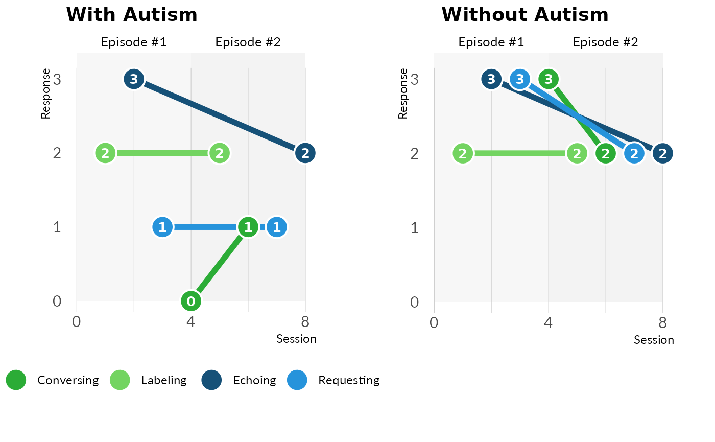
The VOX line chart shows the response types over verbal episodes. Since each verbal episode attempts to solicit a particular response from the speaker, this tells the clinician or behavioral analyst how those response vary over the session.
The two VOX line charts below show two speakers. The speaker on the left is more typical of a person with autism. There is more dispersion in their response types, which continues across all verbal episodes. The speaker on the right is more typical of a person without autism. There is more clustering and overlapping of the lines, indicating more flexibility within a response type, as opposed to variability between response types.
An R user can generate the VOX Line Chart using the
plot_vox_line function.
The function requires a parameter called
df_input_response that follows the Speaker
Data data model. An example of this data frame can be seen with
data("df_input_response_example").
Note that this function can accept only one distinct
date_of_evalution entry inside the
df_input_response.
See ?plot_vox_line and
?df_input_response_example for more details.
# Load example data
data("df_input_response_example")

# Generate a VOX line chart across verbal episodes
plot_vox_line(
  df_input_response = df_input_response_example,
  ind_hide_heading = FALSE)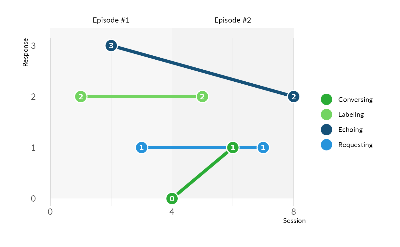
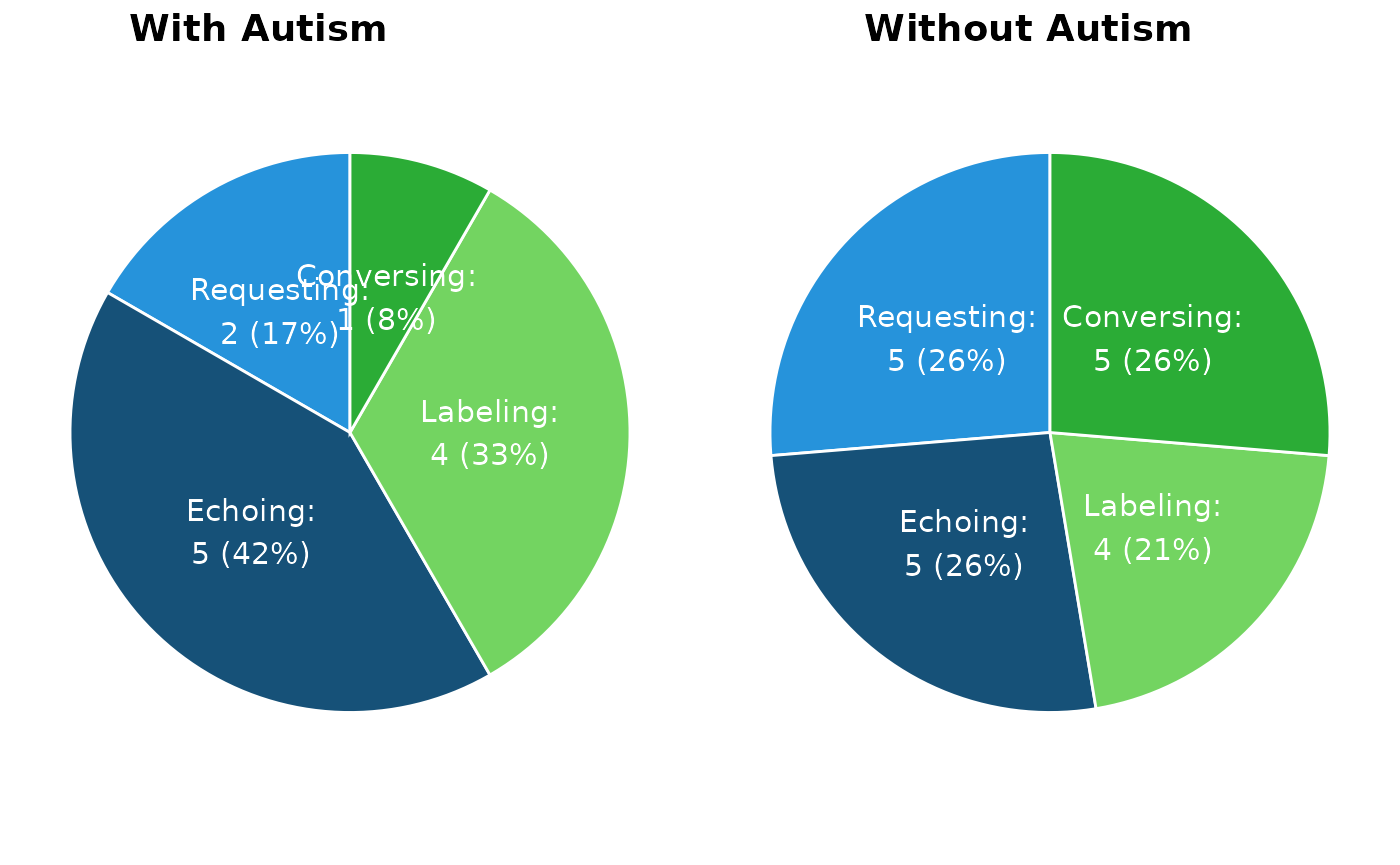
VOX Pie Chart
The VOX Pie Chart shows a visual representation of the speaker’s verbal repertoire, illustrating the balance (or lack thereof) across the four response types (conversing, labeling, echoing, and requesting). The pie chart is similar to the Area Q plot, although it is easier for lay people to understand and uses a different set of metrics.
The two VOX Pie Charts below show two different speakers. The speaker on the left is more typical of a person with autism. The labeling and echoing of the speaker with autism is disproportionately strong compared to conversing and requesting. The speaker on the right shows relative balance in all four response types, which is more typical of someone without autism.
An R user can generate VOX Piechart using the
plot_vox_piechart function.
The function requires a parameter called
df_summarized_response that follows the Summary
Data data model. An example of this data frame can be seen with
data("df_summarized_response_example").
Note that this function can accept only one distinct
date_of_evalution entry inside the
df_summarized_response.
See ?plot_vox_piechart and
?df_summarized_response_example for more details.
# Load and transform df_input_response_example
data("df_input_response_example")
df_summarized_response <- util_summarize_response(df_input_response_example)

### Alternatively
# data("df_summarized_response_example")
# df_summarized_response <- udf_summarized_response_example

# Generate the VOX pie chart
plot_vox_piechart(
  df_summarized_response = df_summarized_response)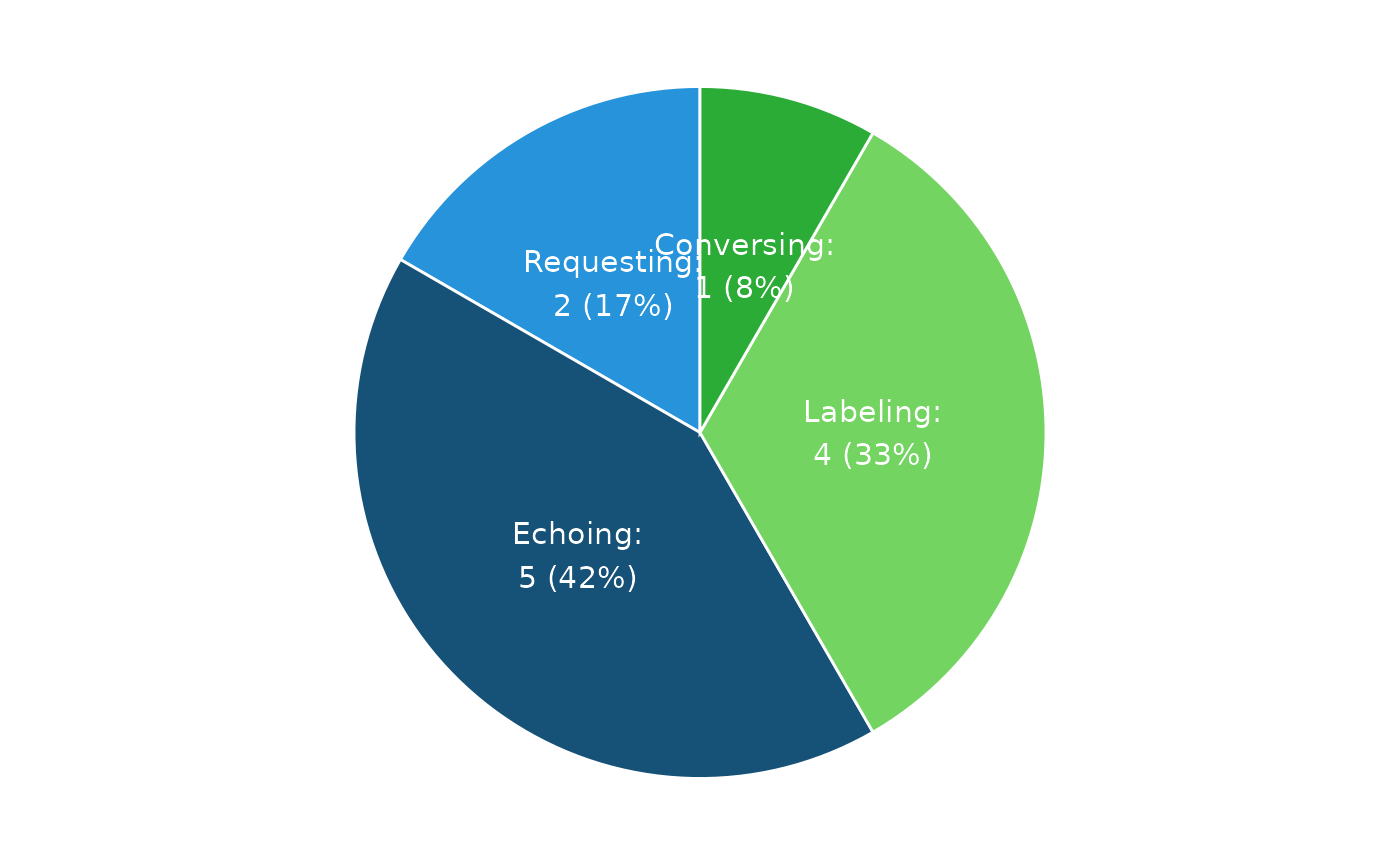
Speaker’s SCoRE
The Speaker’s SCoRE, which stands for Stimulus Control Ratio Equation, quantifies the findings of the VOX Pie Chart to indicate balance or imbalance. The measure provides a range from 0 to 1, with 0 being functionally non-verbal and 1 representing a fluent verbal repertoire.
There are two Speaker’s SCoREs show below. The SCoRE on the left is more typical of a person with autism. The SCoRE on the right is more typical of a person without autism and verbally fluent.
| With Autism | Without Autism |
|---|---|
| 0.6 | 0.92 |
Down below is a guide of Speaker’s SCoREs and how they can help a behavioral analyst with diagnosis.
| SCoRE | Intepretation |
|---|---|
| 0 to .19 | Emergent |
| .20 to .49 | Pratical |
| .50 to .79 | Moderate |
| .80 to 1.00 | Strong |
An R user can generate Speaker’s SCoRE using the
calc_speakers_score function.
The function requires a parameter called
df_summarized_response that follows the Summary
Data data model. An example of this data frame can be seen with
data("df_summarized_response_example"). Note that this
function can accept only one distinct date_of_evalution
entry inside the df_summarized_response.
See ?calc_speakers_score and
?df_summarized_response_example for more details.
# Load and transform df_input_response_example
data("df_input_response_example")
df_summarized_response <- util_summarize_response(df_input_response_example)

### Alternatively
# data("df_summarized_response_example")
# df_summarized_response <- df_summarized_response_example

# Calculate the Speaker's SCoRE
calc_speakers_SCoRE(df_summarized_response = df_summarized_response)
Cochran’s Q Test Table
Cochran’s Q test is used to identify stimulus overselectivity in the speaking repertoire. While some natural variability across the four speaking domains is expected, Cochran’s Q test is used to shown when the differences across domains is statistically significant. In such cases, it may be useful to remove the significantly smaller domains from the prompt hierarchy, as they may not contribute meaningfully.
Down below are Cochran’s Q Test metrics for a speaker with autism and a speaker without autism.
| Measure | With Autism | Without Autism |
|---|---|---|
| Cochran’s Q | 7.5000 | 0.8182 |
| Chance-corrected R | 0.1875 | -0.0952 |
| P-value | 0.0576 | 0.8451 |
An R user can generate the Cochran’s Q Test using the
table_cochrans_q_test function.
The function requires a parameter called
df_input_response that follows the Speaker
Data data model. An example of this data frame can be seen with
data("df_input_response_example"). Note that this function
can accept only one distinct date_of_evalution entry inside
the df_input_response.
See ?table_cochrans_q_test and
?df_input_response_example for more details.
# Load example response data
data("df_input_response_example")

# Generate a summary table with Cochran's Q test and supporting statistics
table_cochrans_q_test(df_input_response = df_input_response_example)
Hierarchy Table
The Hierarchy Table provides an individualized prompting strategy for error-less language learning. Using the most-to-least prompting strategy shown in the table provides a means of language acquisition through abstraction. Convergent multiple control is used to increase the probability of a response. The unnecessary domains are then mixed and varied until the response is emitted purely under its corresponding controlling relation.
The table below shows a speaker with autism. The clinician would start an intervention by focusing on…
| Percent | Conversing | Labeling | Echoing | Requesting |
|---|---|---|---|---|
| 100.0 | CELR | LERC | ELRC | RELC |
| 91.7 |
|
LER | ELR | REL |
| 83.3 | CEL | LEC | ELC |
|
| 75.0 |
|
LE | EL |
|
| 66.7 | CER |
|
ERC | REC |
| 58.4 |
|
|
ER | RE |
| 58.3 | CLR | LRC |
|
RLC |
| 50.0 | CE | LR | EC | RL |
| 41.7 |
|
|
E |
|
| 41.6 | CL | LC |
|
|
| 33.3 |
|
L |
|
|
| 25.0 | CR |
|
|
RC |
| 16.7 |
|
|
|
R |
| 8.3 | C |
|
|
|
An R user can generate the Prompt Hierarchy using the
table_prompt_hieararchy function.
The function requires a parameter called
df_summarized_response that follows the Summary
Data data model. An example of this data frame can be seen with
data("df_summarized_response_example").
Note that this function can accept only one distinct
date_of_evalution entry inside the
df_summarized_response.
See ?table_prompt_hieararchy,
?df_summarized_response_example, and
?util_summarize_response for more details.
# Load example data
library(dplyr)
data("df_summarized_response_example")

# Filter to a single evaluation date, as the table works with one date at a time
dat <- df_summarized_response_example %>%
    filter(date_of_evaluation == max(date_of_evaluation))

# Generate the prompt hierarchy table
table_prompt_hierarchy(df_summarized_response = dat)